
By Carl Slaughter: Roaming publisher and agency catalogs in search of interesting/impressive books/series to feature or authors to interview/profile, I estimate I’ve seen the cover art for 5,000 science fiction, fantasy, and horror books. Few have caught my attention. Fewer still have compelled me to study them in detail. Take, for example, Todd Lockwood’s cover for Visitor, by Hugo winning author C.J. Cherryh, the latest in her long-running Foreigner universe series.
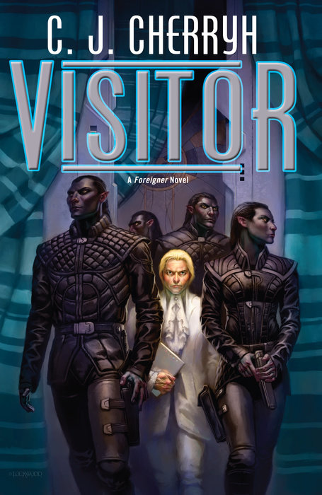
- The aliens are considerably taller than the visitor.
- The aliens have dark skin, the visitor has light skin.
- The aliens have dark hair, the visitor has blond hair.
- The aliens are muscular, the visitor has a smallish, plain physique.
- The aliens are wearing soldier uniforms and armor, the visitor is wearing a diplomacy/business suit.
- The aliens are dressed in solid black, the visitor is dressed in solid white.
- The aliens are carrying weapons, the visitor is carrying a book (folder? laptop?).
- The aliens are looking left and right, as if they are wary of their surroundings (are they in enemy territory, are they bodyguards for the visitor?), the visitor’s attention is fixed straight ahead, as if focused on the task he will accomplish when he reaches his destination (or is he departing the building in the background and thinking about the meeting he just attended?).
- There are 4 aliens, one visitor.
- The visitor is enclaved within the aliens. Again, are they guarding him? Who is he negotiating with/for? Which side wants to assassinate him?
What caught my attention about the cover art for Visitor is that it’s so vivid, making the vast majority of its competition look crude by comparison. Something about the other covers in the Foreigner series caught my attention and I didn’t realize what until I studied them: They have distant shots of multiple characters. Most speculative covers have closeups of one or two characters. Half the covers of the Foreigner series don’t have the characters in a battle-ready pose. The typical speculative cover has a character clutching a gun/sword ready to slay the nearest dragon, zombie, or imperial trooper.
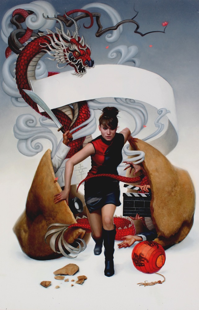
Daniel Dos Santos cover art for Misfortune Cookie by Laura Resnick
Another example of a cover that grabbed my attention and intrigued me is Daniel Dos Santos’ cover for Misfortune Cookie, one of Laura Resnick’s Esther Diamond paranormal mystery novels. Rather than a scene, there are numerous items depicting various elements of the plot. I count at least 4 hands sticking out of that giant fortune cookie. Esther is a striking pose and portrayed as being perpetually on the move as she solves the case. The other art in the Esther Diamond series is almost as good.
What about you? What cover art has caught your attention and why?
Discover more from File 770
Subscribe to get the latest posts to your email.
Some covers can be gorgeous, evocative, etc, but I’m a sucker for clever covers, ones which point up the content of the book without just illustrating it.
One example would be Feed by Mira Grant. You’ve got the RSS symbol in blood daubed on a concrete wall, and the book is about social media and zombies – it’s just a perfect hint at the content.
Another is Envy of Angels by Matt Wallace. Unfortunately I can’t explain why it’s so clever without spoiling the story, but I can say that after reading the story and looking at the cover again I burst out laughing.
I could call a lot of cover my favorite ones. I love covers. Every time somebody goes “Oh, soon there’s gonna be no need for covers because of ebooks” (or for some other reason) I have a rather strong reaction (and I mostly read ebooks).
Some of the best covers are those that can make me add books to my TBR pile despite all rational thought. For example Mur Lafferty’s The Shambling Guides series has covers drawn by one of my favorite comic books artist Jamie McKelvie and that’s enough for me to them to bits. Cover for Molly Tanzer’s Vermilion grabbed me with it’s use of colors and the composition with book’s title.
I also love when series’ covers have strong common motifs (and not just… fonts) like recently redesigned covers of Paul Cornell’s Shadow Police series.
But my most favorite covers are on some of Star Trek novels:
1) Department of Temporal Investigations: Watching the Clock – it’s a time travel story and this giant clock from Greenwich Royal Observatory covered in swirly special effects is extremely cool choice.
2) Section 31: Disavowed – love the grimy spy thriller vibe of this one, it on some Tom Clancy novel this cover would sell books in droves.
3) Immortal Coil – android and the Vitruvian Man, freaking amazing.
4) The Poisoned Chalice – even among Star Trek books there’s a lot of good starship covers. I stared at this incredibly detailed and high-quality USS Titan model for way too long.
…and I think I’ll stop here (for now), this comment is way too long and I could go on.
Not only do I want covers for my ebooks, I sometimes edit the epub to add more versions of the cover. I have around half a dozen covers in my Un Lun Dun epub, for example.
I loved the cover for Beth Cato’s Breath of Earth. It did just what a cover should–make me want to buy the book so I could find out who this woman was and what she was holding. The colors are lovely and the background images are striking.
This is going to seem like a spelling flame, but I’m actually curious, not trying to pick on Carl Slaughter. I see “weary,” substituted for “wary” very commonly, perhaps more often than I see the correct spelling, but I can’t figure out why. Are “weary” and “wary” pronounced the same in some accents?
I am not especially original or erudite when it comes to my taste in art, but I’m an unabashed fangirl for the cover of Prince of Thorns — book by Mark Lawrence, cover by Jason Chan. Yes, it’s got the ubiquitous hooded cloak. Yes, it’s got the ubiquitous swords. I don’t care. The composition is so evocative that it grabs me every time I look at it — and isn’t that what a cover is supposed to do?
The figure in white on the Cherryh cover is not the “visitor”–he’s a diplomat getting ready to deal with the visitor.
@Rea —
Oh gee thanks. You’ve just made me read through all the blurbs in the Foreigner series, which have made me realize that I haven’t ever read any of that series, which made me add the series to Mount TBR. Sigh.
i don’t actually care for glossy portraits of characters on book covers. I can be deterred by such things. One current cover I do quite like is the Jonathan Strahan anthology Drowned Worlds. It has quite a few standard generic elements — small rocket ship with exhaust blazing, complicated structures with lots of right angles and protrusions, a big planet or moon looming in the background — but also thematically appropriate waves breaking over the structure, and a bleak twilight feel enhanced by the pale yellow title and the the general “washed out” gray-blue tone. I’m no art maven but I think this is a good successful cover.
Yeah, the Mighty Mur’s Shambling Guides is another example. Made to Kill by Adam Christopher. Almost all of Michael Swanwick’s covers. Almost all of the Hard Luck Hank series. Most of Jonathan Maberry’s books. Martha Wells’ Raksura series, including the fan art. S.D. Smith’s Green Ember/Ember Falls series. David Liss’ Randoms/Rebels. Erica Satifka’s Stay Crazy.
Bujold has rarely been treated kindly by cover artists (hoo boy), but David Bowers’ cover art for Paladin of Souls is stunning.
Oh yeah, wary, not weary.
My taste in classic SF covers leans towards artists such as Richard Powers and Paul Lehr. For a more contemporary book cover, with a classic feel, I really like Sarah Anne Langton’s cover for Lavie Tidhar’s “Central Station,” from Tachyon Publications.
https://lavietidhar.wordpress.com/central-station/
Fixed now.
Brings to mind that scene from Bull Durham: “Sometimes they do get woolly….“
Jody Lee’s covers for Magic’s Pawn, Magic’s Promise, and Magic’s Price particularly stick in my mind. Sadly those images don’t capture the fancy shiny foil effect (or maybe I’m imagining things and it was just really glossy printing) used for the vegetation in the borders. The colors popping against the black background were really eye-catching and probably helped enhance the sense of color in the main images.
I agree that the cover of Central Station is beautiful; it really did influence my decision to buy the book.
Tommy Arnold’s art for Fran Wilde’s Updraft http://ecx.images-amazon.com/images/I/519ELS0PjvL.jpg – very nice
But more abstract cover design can be really compelling as well eg http://ecx.images-amazon.com/images/I/41WpbiveldL.jpg designed by Janet Hansen
I must be a bit odd. I didn’t like the covers for the Mercedes Lackey books Petréa listed. Maybe because they were very US in style and it is not common in the UK.
I also didn’t like the Paladin of Souls cover much either. I tend to go for a less figurative cover.
Recent stuff that I have liked –
The Fourth Estate edition of The Bees http://pics.cdn.librarything.com/picsizes/5f/1f/5f1f41f0364602a596b4c516967444341587343.jpg
The UK covers of Christopher Priest’s last 3 books for example http://pics.cdn.librarything.com/picsizes/c3/e6/c3e6da8532819e3597667716951444341587343.jpg
Thinking about the topic, I can think of many more compelling movie posters than I can book covers. But for books, some that come to mind are the Discworld covers by Marc Simonetti, especially the one from Small Gods with an upside down, distorted perspective similar to what would have been seen by The Great God Om and the Hat Full of Sky cover showing Tiffany Aching wearing a Hat that is Full of Sky.
I also like the covers for the limited edition Hyperion Cantos books published by Subterranian Press (why couldn’t it have been Hyperion Books? And no, I don’t own a copy of any of those–I am not made of money.)
I like this copy of Fahrenheit 451 (it was a one-off, never mass-produced.)
Of course, for a simple cover, this one is very hard to beat.
BTW, while searching for a link for the F451 cover, I found a blog filled with interesting bokomslags (bokomslagii?)
I agree that the cover art for Visitor is outstanding. Just looking at it, I’d immediately peg the central figure as a diplomat and the other 4 as his honor guard/bodyguard detail, being respectful but alert for danger. And the illustration detail on the outfits is just amazing! Also, notice that at least one of them is definitely female (two are male, I can’t tell about the one at the far rear) and wearing practical armor.
Other cover art I’ve loved:
– The Goblin Emperor, with a dead-perfect illustration of “the burden of the Crown”. I also like the way Maia is looking warily off to one side; he spends most of the book having to do that either figuratively or literally.
– The Madness Season. What you can’t see there is that it’s a wraparound cover, with the other main character on the back.
Camestros is rating recent covers on his blog right now.
I liked the one that features Katsu the clockwork 🐙 In general, it gives you the feel of the book, but in the details you see… the details.
(Also it’s been too long since we did 🐙)
Honestly, Paul Kidbey, specificaly, Nanny Ogg’s Cookbook and the cover to the Diskworld RPG. The art was much better than the game, IMO.
Not quite SF (Though I still say it’s really a cyberpunk novel written in 1990), but the cover of I am Princess X took an image from the book, and used it to draw readers in. The way you first see the anime-style princess, and THEN realize it’s actually a poster on a pole is an excellent example of graphic design.
And as far as graphic design goes, when it comes to science fiction games very little matches the cover to the original Traveller.
I started reading SF in the mid 1970s, and used to love those Gene Szafran covers on the Signet Heinlein books back then.
I’m very fond of the cover to The Lies of Locke Lamora. Also The Wind-up Girl. It is something with the colours.
Pingback: Top 10 Posts for October 2016 | File 770