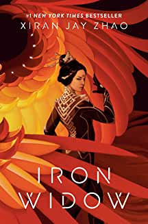
Iain J. ClarkSara Felix wearing one of her tiara designs.
Glasgow 2024 today announced that the 2024 Hugo Award Base will be designed by Iain J. Clark. The trophy for the 2024 Lodestar Award for Best YA Book will be designed by Sara Felix.
These two phenomenal mixed media artists have tirelessly supported Glasgow 2024 through their creativity and generosity, and the committee says they could not imagine a better tribute to the convention, and their own strengths as artists, than having the two design these iconic works.
The final base designs will be revealed as part of the convention’s Opening Ceremony in Glasgow on 8th August.
THE 2024 HUGO AWARD BASE. Every year the iconic Hugo rocket is given a unique base design to reflect the personality of the hosting Worldcon. This year’s designer, Iain J. Clark, has been working with Glasgow 2024 since 2019.
Iain says “I’ve known about the Hugo Awards for most of my adult life (I vividly remember Babylon 5 winning Best Dramatic Presentation in 1996) but the idea that I could design a base for the iconic trophy never entered my head. You might as well have told me I’d design an Oscar. And then Glasgow asked me, and I was stunned – so naturally I panicked and said yes. It’s a huge honor, a huge responsibility, and I take it very seriously. I can’t wait for everyone to see it.”
Iain works in a variety of materials, primarily acrylics. He has twice won the BSFA Best Artwork Award (for “Shipbuilding Over The Clyde” in 2020, and for “Glasgow Green Woman” in 2021); both pieces were created for the Glasgow 2024 Worldcon. He has been a finalist for the Best Fan Artist Hugo Award in 2020, 2021, 2022 and 2023.
For the Dublin 2019 Worldcon he created artworks including the cover of the Souvenir Book, and for Glasgow 2024 his art is appearing on banners, adverts, postcards, campaigns and t-shirts.
THE 2024 LODESTAR AWARD. The Lodestar Award was first given in 2018, and since its inception has been celebrating the beauty of YA fiction. The first Lodestar award was designed by Sara Felix beginning a trend of trophies that honour the very best in YA Science Fiction and Fantasy.
According to Sara: “I was happy to be asked to design the Lodestar Award as it is one of my favourite awards at the Hugos. In all my projects with Glasgow I hope the award is as fantastic as the finalists and the winners in this category!”
Sara Felix is a mixed media artist who has previously designed the Hugo Award bases in 2016 and 2018 (the latter co-designed with Vincent Villafranca). She has designed multiple Lodestar awards and other special awards for Worldcons in the past. She is the designer of the Glasgow 2024 logo and much of the art used by the convention. Her space art and tiaras can be seen at multiple conventions around the US and UK throughout each year.
By Iain Clark: James Bacon at Journey Planet approached me with an interesting proposition: would I be interested in painting a new version of a Dave Gibbons Watchmen cover, for an issue of the fanzine dedicated to the comic, but with a twist?
This was a challenge, and to be honest, it wasn’t an automatic yes.
I’ve done a few covers for Journey Planet (issues 65, 69 and 74), not to mention several pieces for the Glasgow 2024 Worldcon including the BSFA award-winning “Shipbuilding Over the Clyde” (2020) and “Glasgow Green Woman” (2021). But these were my own compositions, and I have no experience as a copyist. Also Dave Gibbons is a world-renowned genius. I, charitably, am not.
The cover was one of James’ favorites, the colors and contrast being to his liking and it was used for the Watchmen Portfolio, a huge 15.5” x 10” portfolio containing the French and US comic covers and the advertisements promoting that comic, produced in 1988.
Fortunately the cover is a clean graphic design with no figures in it. I’m pretty good at replicating a reference photo when doing fan art, and this seemed achievable so I cautiously said yes, thus launching my career as an international art forger.
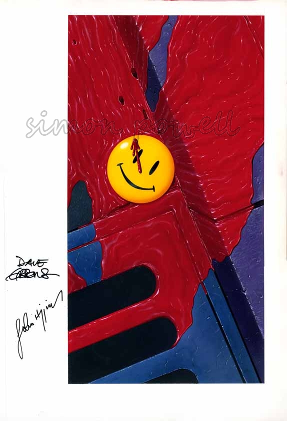
The original Dave Gibbons art
The ingenious twist for the Journey Planet version, suggested by Pádraig Ó Méalóid, was to have the famous smiley yellow badge upside down for use on the back cover (with the original art as the front cover); the idea being to imagine an alternate universe in which the badge fell, unnoticed, face down in the gutter and the whole sequence of events presented in the comics unraveled.
To complicate matters I was then asked if the final painting could still have the badge face up. As the face of the badge is very smooth, overpainting the smiley face over the reverse of the badge seemed impractical so I chose to start by creating as exact a copy of the original as I could manage, and then do the back of the badge separately to be added digitally.
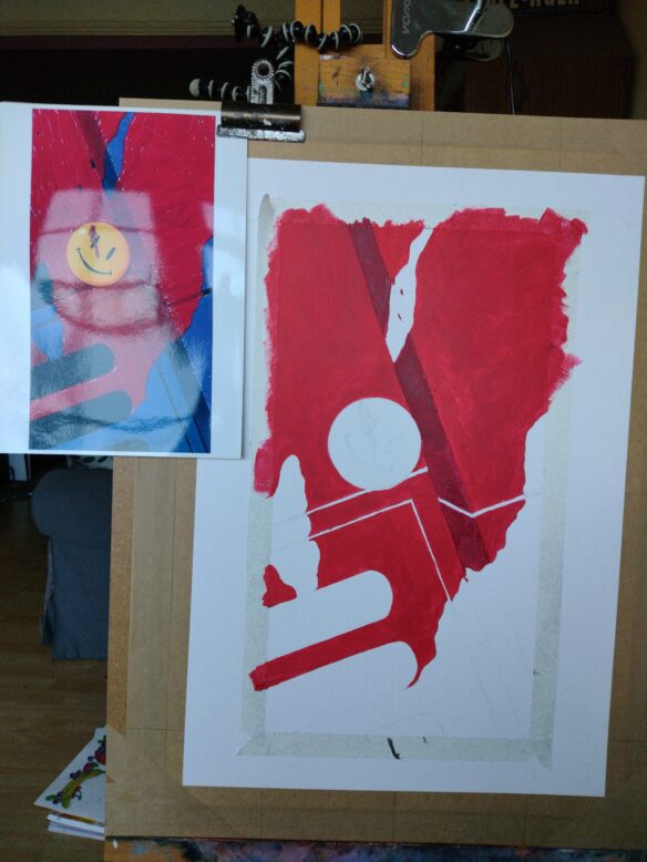
The color balance of the various reference sources varied considerably. I went with what seemed a good balance of the sources that drew out the subtle color differences in parts of the image (for example the purplish kerb and the slightly bluer drain). Then it was a case of gridding-up the image, transferring it with pencils to stretched 250 gsm paper on a board, and getting to work.
That’s when the fun began.
I don’t know what scale or medium Dave Gibbons used for the original but as I’m primarily an acrylic painter that’s what I chose. I began by blocking in base areas of color onto my pencils
My copy at an early stage, with a print-out of the original art clipped to one side.
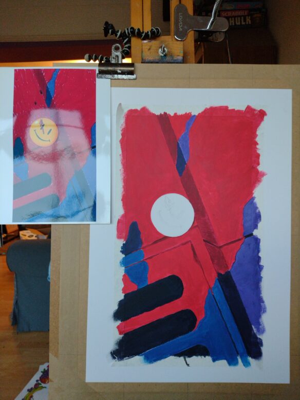
Once I had the color blocked in I started adding the texture and shade. The more I worked the more it became clear that copying someone else’s art style is uniquely challenging. Dave Gibbons had skillfully rendered the flowing blood in a distinctive, stylized way with detailed patterns of light and shade in the rivulets, and glints of light in specific places. His image is no doubt a product of his experience, skill and countless spontaneous choices as he worked. Rendering the blood in my own style would have been relatively straightforward. Matching another artist’s tiny creative decisions was much harder, and a long way from intuitive. The reference images also varied considerably in the level of contrast which greatly affects how visible the blood textures and highlights become.
Acrylics are not the easiest medium to blend smoothly (my fault for choosing them!), so I used a slow drying medium, using several layers and some scumbling with the brush. It took a lot of rework to create subtly blended acrylics which closely (but by no means exactly) mirrored the original. Fortunately Mr. Gibbons’ style doesn’t show brush marks so there was no need to replicate that degree of spontaneity, but it was still a case of very carefully matching something that was originally far more natural. The process was instructive, and I certainly gained a new appreciation for the incredible detail and mastery in the original art.
I kept adjusting as I went to match the shapes and textures of the original as closely as I could, for example adding a thin wash of scarlet ink at a fairly late stage to give the blood more lustre and saturation. Again this is very much a judgement call as my reference images of the original varied from bright scarlet to deep magenta.
My copy nearing completion
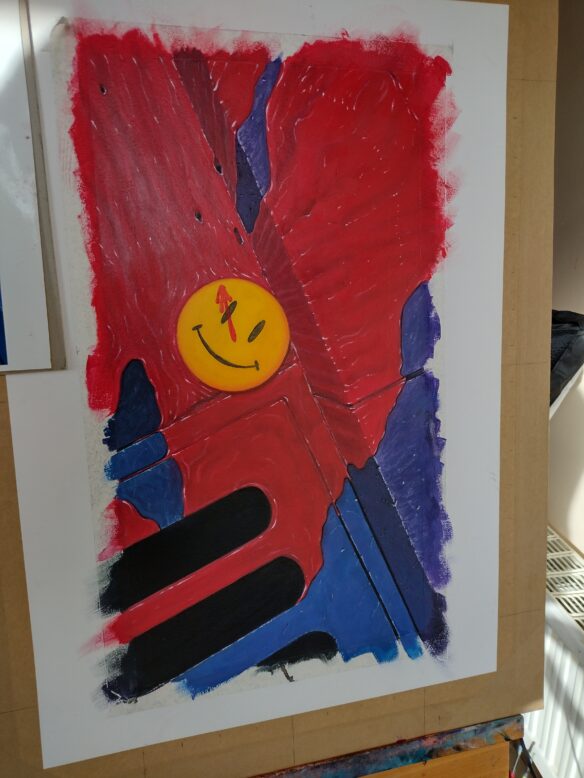
The badge was its own challenge. I nearly had a disaster when I tried to clean up a stray mark and ripped off a coin-sized chunk of the surface of the paper, right on the smoothest and least forgiving part of the image where there was no chance of adding texture to conceal the problem. After a brief trip to the black abyss of despair and a short flirtation with the idea of throwing the painting out of the window I decided to try a very fine grade sandpaper and rich white gesso to rescue the painting and bring the surface of the badge back to smooth. If I’d torn right through the paper you probably wouldn’t be reading this article.
Once I was happy with the painting I added a little “CLARK AFTER GIBBONS” to the bottom to keep me out of art prison, thus ending my career as an international art forger.
Finally I moved onto the back of the badge, which I did to the same scale as the rest of the image. Pádraig was able to supply photos of the back of his original badges from 1986 which was immeasurably helpful. The direction of the pin was to match the “clock hand” blood splatter on the original so I made sure that the light direction matched the rest of the image, and that the tone of the yellow edging matched the front. This was easily the most straightforward part of the project as I was free to make my own art choices. I added one blob of Gibbons-style blood to integrate it with the rest of the image.
The back of the badge
I used Photoshop to add my reversed badge to my full painting, and did a bit of color correction to match the reference.
The final composited image.
All told this painting took me a couple of weeks around my day job. It was much more time consuming than I imagined at the outset because of the unexpected demands of matching another artist’s creative choices, but I’m quite pleased with how it turned out.
James and the Journey Planet team were delighted with the image, and so impressed and enthusiastic as James can be, that they asked to use the images for both the front and back covers. Michael Carroll worked up the sidebar logos in keeping with the original individual issues of Watchmen. The version with the upside-down badge went on the front cover with a yellow logo, and the image with the face-up badge went on the back with a green logo.
Ninety two pages of work from a variety of writers, fan and professional alike – with some fascinating insights – were sandwiched between these pieces when the team Jpresented the Fanzine to the world.
James then asked me if I would share my experience here on File 770. I’m very pleased with how the cover turned out. This was a different kind of undertaking for me but that made it an enjoyable challenge in its own way, one that it stretched me as an artist in unexpected directions by forcing me to realize a specific effect. I have very vivid memories of reading Watchmen when it was first collected (my elderly copy is the British yellow cover from 1987, 3rd printing). Even back then it had a considerable reputation and I gave it the close attention of a hallowed text. I’m happy to have contributed my own little tribute with this cover and grateful to Journey Planet for thinking of me!
The British Science Fiction Association today announced the winners of the 2021 BSFA Awards.
The awards are voted on by members of the British Science Fiction Association and by the members of the year’s Eastercon, the national science fiction convention, held since 1955.
The BSFA Awards have been presented annually since 1970. This year marks the launch of a new category, the Best Book for Younger Readers.
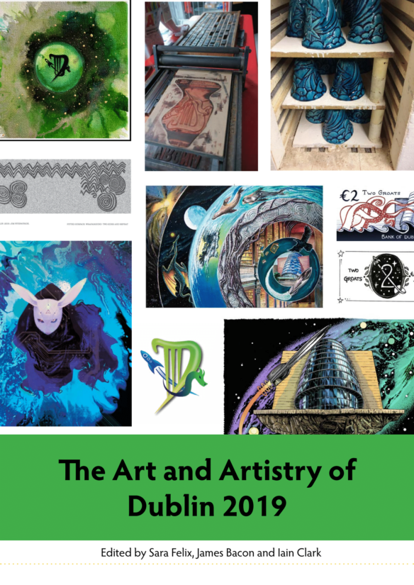
By Sara Felix, Iain Clark, and James Bacon: The Dublin 2019 team have continued to work on a number of matters, even though the Worldcon is now a fond memory, and one of the projects that captured their imagination was having a record of the Art and Artistry that occurred for and at Dublin 2019 An Irish Wolrdcon.
Sara Felix, James Bacon and Iain Clark have worked with Serena Culfeather from the Dublin 2019 Art Show and a host of brilliant artists on a post con publication for a while now, looking at and celebrating the Art and Artistry of Dublin 2019.
As the team did this themselves, they found out things they had missed!
We are so very grateful to all the amazing artists who allow us to share and enjoy their work, and brilliance. While we celebrate them, they brought so much to Dublin 2019 and we hope that as you enjoy this, you pursue and look for more of their fabulous work.