[Introduction: Francis Hamit’s Kickstarter for Starmen: A Novel runs until October 10. You can get the ebook for a one dollar donation. Meanwhile, the author would like your opinion about the cover….]
By Francis Hamit: I really am in a quandary about which cover to use, so I would like feedback.
Based on feedback, I moved the title a little. Small changes sometimes make a big difference. I think this is very powerful and catches the eye.
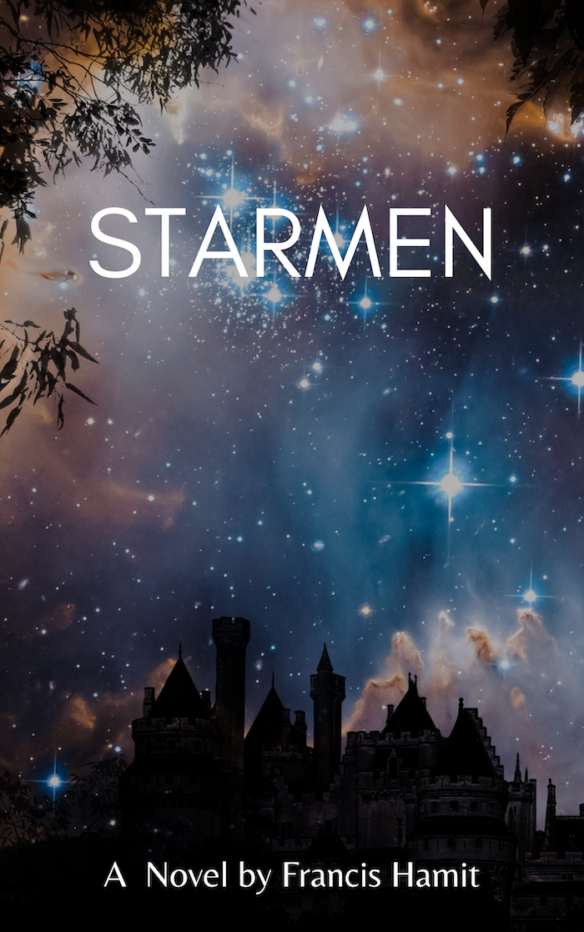
The original cover developed and donated by Markee Book Designs is here:
As you can see this is more narrative, based upon the opening paragraphs. Quite a bit of work went into this but they wanted a sample for their portfolio and I am happy to oblige.
The first book cover I bought was for The Shenandoah Spy. It cost me over $2,000 but certainly sold the story while also feeding my passion for historical accuracy. These new covers cost me very little and the one from Canva took me an hour of playing around with a blank image and placing type.
I have bought other covers for $100 each and just moved virtual type around . It’s not hard for me. I took Design in college and I was a professional photographer for eleven years. That was all about designing as I framed the shot either in the camera or the darkroom. (Yeah, I was in the photochemical world). I was crushed out of that business by K-Mart and their 99-cent color portraits.
These low cost and free blanks for book covers are yet another example of a hard-won artistic profession being crushed by a low cost and “good enough” alternative.
So you tell me; which cover will sell more books? That is, after all, the name of the game.
Leave your vote in comments here.
And if you have not yet donated to get the E-book please do so. Everyone gets that. Other items at higher reward tiers.
[Reprinted with permission.]
Discover more from File 770
Subscribe to get the latest posts to your email.
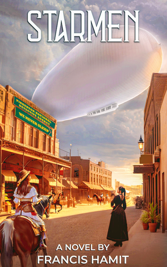
I’m very curious to know how both of these covers could be appropriate for the same book. At first glance, both are appealing; however, I’m going with the first (castle), because AI has, as is its wont, produced some oddly deformed horses—also note that the foreground rider’s saddle has no stirrups, at least on that side.
Generic covers showing a city / townscape with a darkened, starry sky would be the type of cover I would look at and pass by without a second thought–the western scene with the airship, now that has grabbed my attention and makes me want to know more about the story.
I would go with the second. It is more attention grabbing and raises questions the potential reader might be interested in learning the answers to.
The second is more interesting; I’d go with that. Why should you value my opinion? I was editor/publisher of two Hugo winning zines, and bought full color cover artwork for both. They were sold in retail outlets, so believe me, I know what I’m talking about. (See my Wikipedia page)
Go with the second one.
Definitely the original with the Western street and airship. That makes me curious to read it. The alternate is way too generic.
Numero dos, but lose the “a novel by” and enlarge your name at the bottom. I have no design education, but I know what makes me buy a book.
Given the Kickstarter plot description, I’d vote for #2, which clearly connects to many points in that summary. “Starmen” to me implies “men from the stars = sf aliens (human/humanoid or otherwise). (And I wasn’t sure whether “Starmen” refers to “star men” versus something else, like a conflated mispronounciation of “stormin'” or whatever. If that’s how the flying Apaches get referred to, in the text, , OK, but neither cover seems to make these connections. Perhaps tweak/change the title? Either way, Cover 2 clearly tells us enough to be helpful. Best of luck!
The second cover is a LOT less generic.
Omit “A novel by”. We know it’s a novel.
Shadows and dark areas on the street need to be a bit darker; light areas a bit lighter to increase the contrast.
The first cover is intensely generic.
The second cover, and it’s dichotomy between the Old West town and the modern Zeppelin in the sky, would draw me in, make me pick it up, and check out the book further.
The first cover is similar to literally thousands I’ve seen perusing books on the Internet. Almost none of which I’ve gone on to buy. (Usually because someone whose taste I trust has said “Ignore the cover, it’s actually a good book.”)
I agree with the majority, the Western-ish one with the airship. I also agree that you should drop “a novel by” and upsize your name.
If your novel has major female characters and you are hoping that will be a selling point for it, you will probably want to go with the one with the airship and Western town, because that one has women in the foreground of the illustration.
If I were looking at a display of books, or scrolling through a grid of covers online, my eye would slide off the first cover and land on the second. Figuratively speaking of course.
I like the second just as artwork but I’ll be damned if it makes me think of the subject matter. Just a Western town where an airship happened to show up.
Joe Lansdale wrote an episode of Batman: The Animated Series which featured Jonah Hex in the Wild West with an airship as a part of the plot.
The first is quite pretty, but vacuous. Says nothing about the book. I assume it’s about Enlightenment astronomers in an English country house, and since I’ve still not read The Lunar Men, I’d go to Mt TBR first.
The second book says quite clearly that it’s cowboys Vs aliens. If be more likely to read the blurb.
@Jim Janney,
Yes, it’s not only about how a book cover looks on a physical book, but also how it looks as an icon online. Ideally you want something that stands out enough to grab the eye, and on further examination, provides visual cues to convey enough of what the book is about to make the viewer want to try it.
Remember when the Twilight books came out? It started a trend of black book covers as others tried to get in on that market.