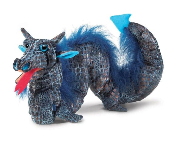
Review by Camille Alexa: Folkmanis has gained an excellent reputation in recent decades for its overwhelming array of puppets. The plushies range from eerily lifelike to utterly fantastical. Right now I’m holding the Sea Serpent Stage Puppet in my hand. Well, okay, I’m wearing it on my hand. . . is that so wrong?
Fun facts gleaned from the tag:
Made in China for Folkmanis, Emeryville, CA
Contents: Polyester fiber, polyurethane foam
Care: surface washable with cold water; air dry
This little sucker has incredibly well-articulated features for a plush puppet, and lots of different elements: beanbag-filled flaps (ears? horns?); nostrils deep enough to play around with — pull out as though puffing and huffing, or push deep in, which gives the Serpent a look of deep concentration; eyes with great range of movement, though I could never quite figure out how to manipulate them with the interior ring which begs to be toggled, explored, experimented with. I imagine someone could become quite proficient with enough practice at the eye ring — eyes bulging, goggling, recessing . . . overall an intriguing addition to the puppet’s functionality.
The hide’s scales are a rich lustrous aqua, and the fins have a delicate rippled quality to their accordion pleats along the spine and “hands” (flippers? the attached play calls them fins — more about the play in a moment). This is a very shiny, sparkly puppet. The scale pattern is printed into the fabric rather than sewn, and there’s mercifully little glitter fallout; it’s not at all like playing with one of those toys which seem to herald the glitterpocalypse.
For a smaller hand, it might be tricky to manipulate multiple elements at once — the flippers, the eyes, the mouth. And unless you’re willing to experiment with both hands, it would be impossible to use all the manipulable features at the same time — the tongue (oddly the most satisfying part of the puppet: forked and bright red and very expressive), the jaw (typical open/closed puppet style, though with two great soft rubber accent teeth — fangs? — one on each side of the mouth), the eyes (goggling; recessed; recessed & goggling). At least it’s a nice, long puppet, reaching nearly to my elbow, so with a little practice one can achieve some great serpentine motion, like a sea creature riding waves. My brief forays into two-handed use produce some lovely undulating neck motion.
Attached by a small cord about the neck is a play, “Help Wanted.” (Opening: “Sea Serpentis center stage looking around nervously. Enter Cat. . . “)
A brief synopsis of the play:
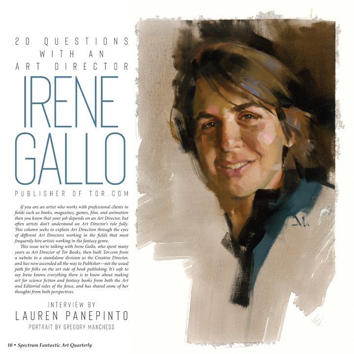
Cat asks Serpent for a resume and display of typing skills, neither of which the Sea Serpent can offer due to the lack of hands (the Serpent explains). When asked for a list of useful skills, Serpent replies, “Well, I’m great at capsizing large ships, I can eat 20 sailors per minute, I am very good at creating giant whirlpools on short notice . . . and I am highly impervious to evil.”
Serpent describes past employment, including a Mermaid: “for about two hundred years, mostly just chauffeuring her around on my back and eating her enemies,” though there were also “more menial tasks, dredging harbors and whatnot.”
A bargain for gainful employment is eventually struck at the pay rate of five trunks of pirate treasure per year, with benefits.
The end.
Camille Alexa shares her Edwardian home in the Pacific Northwest with an array of fossils, dried willow branches, pressed flowers, and other very pretty dead things. Her first book, Push Of The Sky, earned a starred review in Publishers Weekly and was a finalist for the Endeavour Award. She likes her humor dark and her horror funny, and can be found on twitter @camillealexa or on LiveJournal as camillealexa.
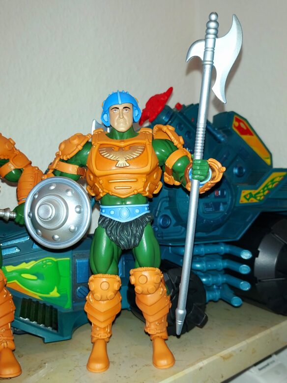
Photo of the Palace Guard figure with Scott Neitlich’s face. Photo by Cora Buhlert.
By Cora Buhlert:
INTRODUCTION: A current controversy in the toy collector world revolves around toy industry insider Scott Neitlich who worked for various companies and is now an independent consultant. He has a YouTube channel named Spector Creative and makes videos offering an inside look into the toy industry. He’s long been something of a controversial figure and his videos gradually tipped from interesting insights to increasingly bad takes and things which were just plain wrong. Then one day, the channel was suddenly gone from YouTube. Turned out he had been using random photos he found on the internet without permission, including stock photos which were watermarked.
Ethan Wilson, who runs an action figure review blog named The Figure in Question, found that Neitlich had been using his photos without permission or credit and submitted some copyright complaints to YouTube, who removed the entire channel. Neitlich contacted Wilson and begged for him to retract the copyright claims and promised to remove all photos once he regained access to his channel. So Ethan Wilson retracted his copyright complaints, whereupon Neitlich did not remove the photos and started badmouthing Wilson and sending his followers after him. It’s gotten steadily uglier and weirder since then.
SCOTT NEITLICH AND SPECTOR CREATIVE. Protagonist No. 1 is Scott Neitlich who runs a YouTube channel called Spector Creative. Neitlich is a toy industry insider who used to work for various toy companies, most notably Mattel. He was the Mattel brand manager in charge of the Masters of the Universe Classics and DC Universe Classics collector toy lines from 2008 to 2016. Neitlich championed Masters of the Universe at Mattel, when no one else did, and many of the names he gave to characters who never had any are still used in the various cartoons, comics, etc… to this day. However, Neitlich was a controversial figure among Masters of the Universe fans, because of quality control issues with some of the figures (one figure’s hips infamously shattered straight out of the packaging) and questionable decisions such as using the name a fan had given an obscure character for an action figure without crediting that fan, asking the design team to give a palace guard action figure his face and – most notably – inserting a Mary Sue character named the Mighty Spector that he had created as a kid into the Masters of the Universe line. That figure is so disliked you can still find it in stock at most collectible shops more than ten years later. Recently, a German collectible shop couldn’t even sell their leftover stock of Mighty Spector figures at fifty percent off.
After leaving Mattel (and there is some debate going on whether he left voluntarily or was asked to leave), Neitlich worked at a couple of other toy and merchandise companies and eventually started a consulting business for the toy and entertainment industry called Spector Creative as well as a YouTube channel. The YouTube channel offers an insider look at the toy industry and lots of background information on the Masters of the Universe and DC toy lines Neitlich worked on, which is how I came across his channel. The channel claims to be educational, but Neitlich also uses it to advertise his consulting business. One thing I noticed immediately is that the videos occasionally contained watermarked stock images, i.e. he had just grabbed those images without paying for the license which is a huge no no for anything you post in public. If you actually use your videos to advertise your business, it’s an even bigger no-no.
Neitlich also posted increasingly bad takes and flat out wrong claims. He claimed that Mattel was about to lose the Masters of the Universe license, even though Mattel actually owns the brand – the only rights issues involve some characters created for the 1980s He-Man and She-Ra cartoons. Neitlich seems to be quite bitter that the current Masters of the Universe toy lines are getting more corporate support than his Classics line did and keeps claiming these toy lines are about to be cancelled and doubled down on his claims, even after people told him that new toys were shipping and sold in stores. I think the thing which convinced me that nothing this guy said should be taken seriously was when he called the Nuremberg toy fair, which is only the biggest and most important toy industry trade fair in the world, “some obscure German con”. Because how can someone work in an industry for twenty years and not know the most important industry event?
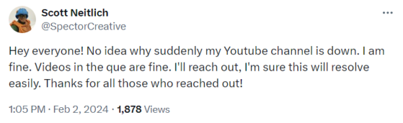
In early February, the Spector Creative YouTube channel was suddenly gone. Neitlich posted on Twitter that he had no idea what happened.
Ten days later or so, the channel returned and Neitlich posted a video explaining that his channel had received more than thirty copyright complaints in the span of a week or so, which is why YouTube terminated it. He also claimed that YouTube found those complaints unjustified and that his channel and his livelihood, since he uses his channel to advertise his business, had been held hostage. (The video formerly could be viewed at this link, however, Neitlich recently set the entire channel to private, not just the contested videos.)
The Spector Creative channel never completely disappeared again, but there would be no new videos for a while and then Neitlich popped up again and said he had been getting more copyright strikes. He also claimed that the person submitting the copyright complaints, one Ethan Wilson, who runs a toy review blog called The Figure in Question, was blackmailing him.
(Two follow-up videos could formerly be viewed here and here.)
THAT JUNKMAN. Another toy and pop culture YouTube channel called That Junkman also got involved. I’d never heard of that channel before, but he posts a lot of right-wing culture war stuff along with talking about toys, which tells you everything you need to know about this person. He posted several videos directly attacking Ethan Wilson.
ETHAN WILSON. On March 8, Ethan Wilson posted his side of the story on his blog, complete with screenshots of his e-mail exchanges with Scott Neitlich: “About This Spector Creative Thing”.
Basically, Wilson ran across Neitlich’s YouTube channel and saw that Neitlich had been using toy photos from Ethan’s review blog The Figure in Question without permission or attribution and complained to YouTube. Wilson also went through the videos and found lots and lots of instances of his photos being used, not just one or two. There’s a screenshot of the initial thirty-two copyright complaints here.
The weirdest bit is that at least one of the figures, Hydron, is a Masters of the Universe Classics figure, i.e. a figure Neitlich worked on and that he owns, so he could just have photographed his own figure.
Anyway, Scott Neitlich e-mailed Ethan Wilson and begged him to retract his copyright complaints, so he could regain access to his channel. He also promised to remove the photos in question or credit Wilson. So Wilson retracted the claims and Neitlich got his channel back, only to do absolutely nothing of what he promised. He neither removed the photos nor credited Ethan Wilson. Instead, Neitlich claims fair use, because his channel is informational and educational (even though he is using it to advertise his business). He also claims that Ethan Wilson does not actually own the copyright to his own photos, because he did not register copyright. However, according to current US law, copyright is granted automatically from the moment of creation. Neitlich also claimed that Wilson couldn’t copyright the photos, because they were generic photos of licensed products trademarked by somebody else. Again, this is not how copyright works. And the fact that someone who spent years working in an industry where copyright and trademark law are very important, doesn’t have even a basic knowledge of how these things work, is very telling.
Ethan Wilson was interviewed twice on the Dad-at-Arms YouTube channel, which is a Masters of the Universe fan channel, focusing on interviewing people involved with Masters of the Universe, mostly with the cartoons and comics. Colt, who runs the channel, is a former journalist and another toy collector alerted him to the issue.
In the meantime, several other people have also come forward and said that Neitlich has used their photos, fan art, graphics, etc… without permission or credit, but they just didn’t bother complaining to YouTube. He’s never used one of my photos so far, though I’m not sure whether I should feel glad or insulted.
Neitlich once again lost access to his channel and posted a dramatic, “I’m losing my channel for good” post on the Community tab of his channel (which he apparently could access). (The post is no longer online, but was formerly available close to the top of the Community tab.
A bit later, he posted this tweet:
Note that the Ace of Spades is both the logo of his company as well as of his Mighty Spector character.
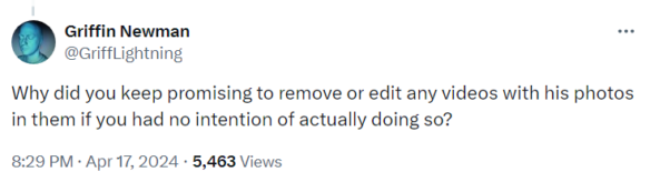
Pretty much the first response to that tweet came from the Twitter account of Griffin Newman, toy collector and the voice actor who plays Orko in Masters of the Universe: Revelation and Revolution:
Eventually, Neitlich regained control of his channel and posted yet another video complaining about copyright trolls blackmailing him and proved once again that he has no idea how copyright and trademark law work in the US. Neitlich also claims he got a lawyer, though Ethan Wilson claims he never received any letters from any lawyers.
CLOWNFISH TV VS. DAD-AT-ARMS. Meanwhile, Clownfish TV, a culture war focused YouTube channel also got in on the action. Clownfish TV has a long-running feud with Dad-at-Arms, because DAA called them out for blatantly untrue claims about Masters of the Universe: Revelation and for attacks on the creators of the show. As a result, the Clownfish TV people are angry that Dad-at-Arms got interviews with various people involved with the Masters of the Universe: Revelation and Revolution (producers, directors, writers and even a voice actor), while they didn’t get these interviews, even though they have more followers than he does. Gee, I wonder why people don’t want to talk to a YouTube channel that insulted and badmouthed them. Anyway, Clownfish TV interviewed Scott Neitlich, who professed to be a big fan of their channel:
On a side note, Scott Neitlich also recently self-published a Greek mythology based graphic novel named Myth War that he’s written. Neitlich does have some experience with writing comics, since he wrote some of the Masters of the Universe pack-in mini-comics. However – and here is the kicker – Neitlich used AI generated art for his graphic novel:
CONCLUSION. This is where things stand now: Scott Neitlich and Ethan Wilson are still feuding, Neitlich still uses other people’s work without permission and is slowly but steadily losing whatever credibility he still had.
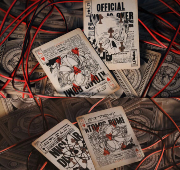
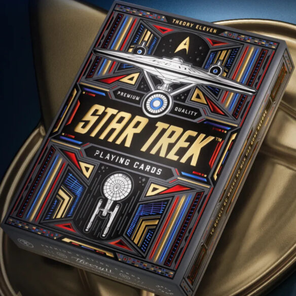
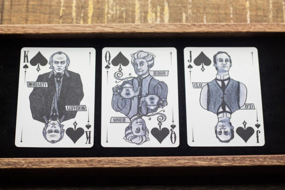
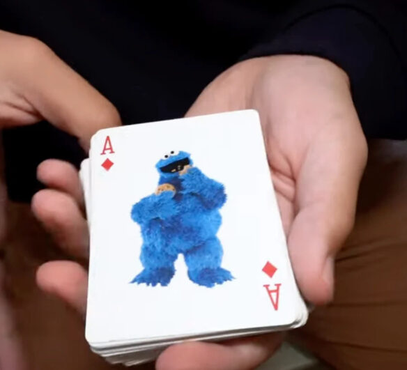
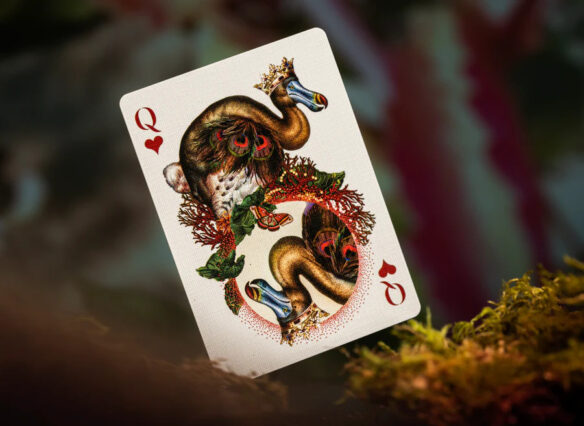
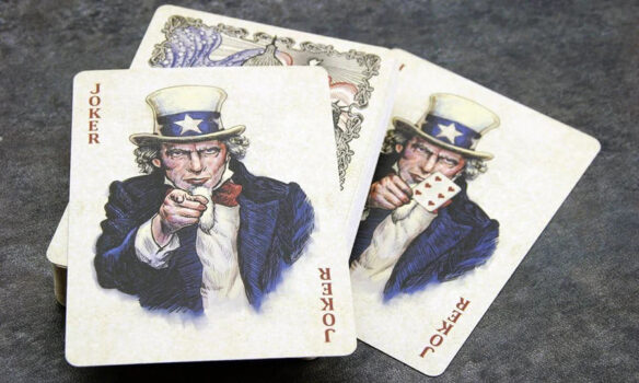
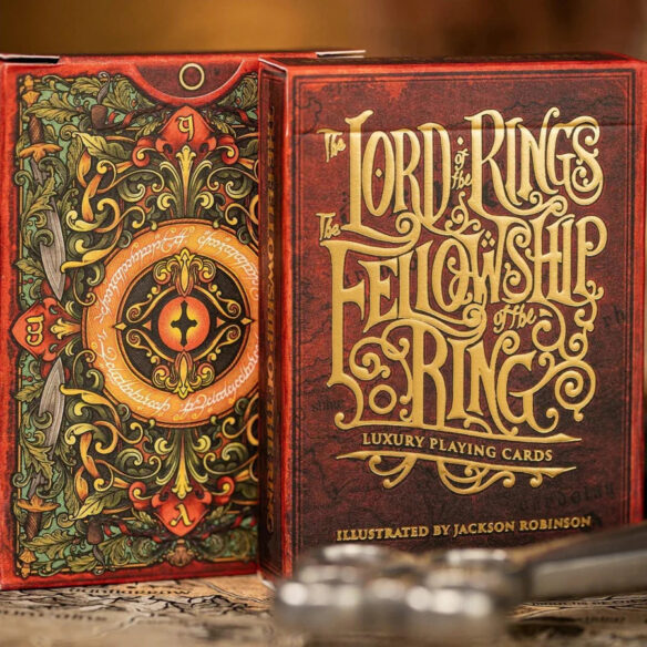
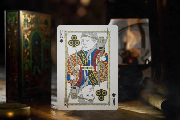
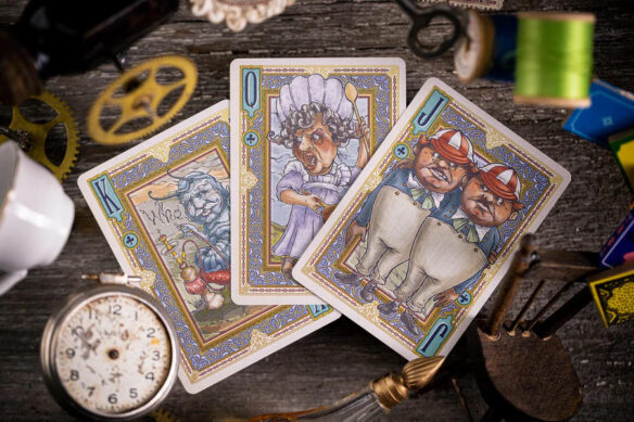
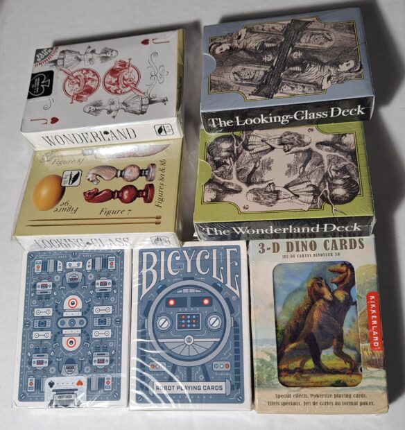
By Daniel Dern: I’m not immediately moved to order any for myself — I’ve already got enough interesting (non-magical) card decks (robots, 3D dinosaurs, Alice, etc), but surely some Filers will be bemused, perhaps even moved to acquire. These are the ones that seemed most sfnal, but there’s lots more.
BTW, it looks like you can find many of these decks at significantly better prices (e.g. give or take shipping costs) at MJMagic.com. (Note, I have not yet ordered from this store/shop)
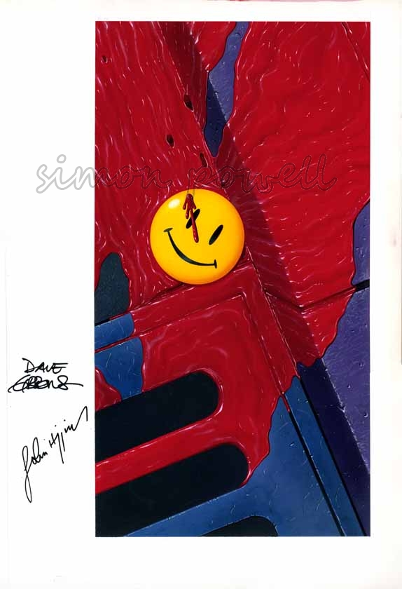
By Iain Clark: James Bacon at Journey Planet approached me with an interesting proposition: would I be interested in painting a new version of a Dave Gibbons Watchmen cover, for an issue of the fanzine dedicated to the comic, but with a twist?
This was a challenge, and to be honest, it wasn’t an automatic yes.
I’ve done a few covers for Journey Planet (issues 65, 69 and 74), not to mention several pieces for the Glasgow 2024 Worldcon including the BSFA award-winning “Shipbuilding Over the Clyde” (2020) and “Glasgow Green Woman” (2021). But these were my own compositions, and I have no experience as a copyist. Also Dave Gibbons is a world-renowned genius. I, charitably, am not.
The cover was one of James’ favorites, the colors and contrast being to his liking and it was used for the Watchmen Portfolio, a huge 15.5” x 10” portfolio containing the French and US comic covers and the advertisements promoting that comic, produced in 1988.
Fortunately the cover is a clean graphic design with no figures in it. I’m pretty good at replicating a reference photo when doing fan art, and this seemed achievable so I cautiously said yes, thus launching my career as an international art forger.
The original Dave Gibbons art
The ingenious twist for the Journey Planet version, suggested by Pádraig Ó Méalóid, was to have the famous smiley yellow badge upside down for use on the back cover (with the original art as the front cover); the idea being to imagine an alternate universe in which the badge fell, unnoticed, face down in the gutter and the whole sequence of events presented in the comics unraveled.
To complicate matters I was then asked if the final painting could still have the badge face up. As the face of the badge is very smooth, overpainting the smiley face over the reverse of the badge seemed impractical so I chose to start by creating as exact a copy of the original as I could manage, and then do the back of the badge separately to be added digitally.
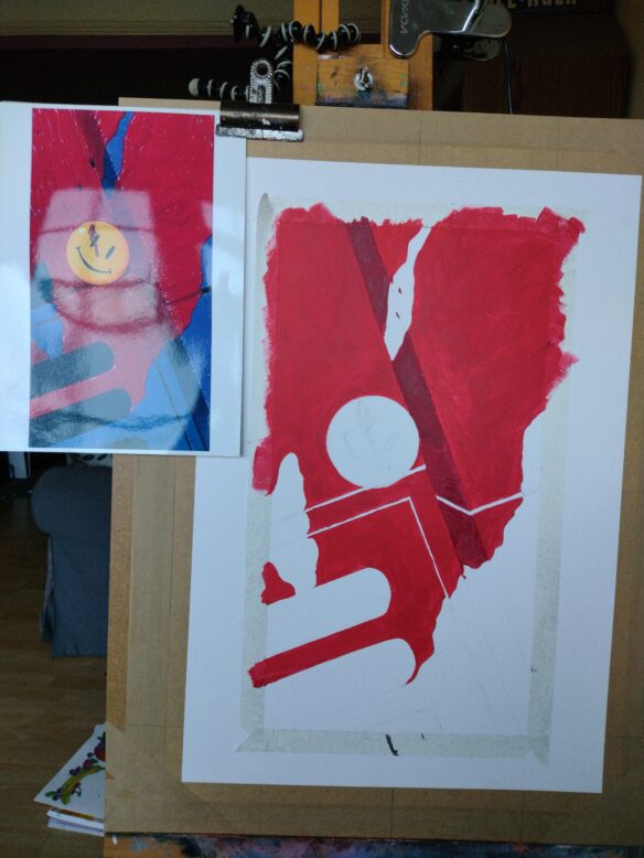
The color balance of the various reference sources varied considerably. I went with what seemed a good balance of the sources that drew out the subtle color differences in parts of the image (for example the purplish kerb and the slightly bluer drain). Then it was a case of gridding-up the image, transferring it with pencils to stretched 250 gsm paper on a board, and getting to work.
That’s when the fun began.
I don’t know what scale or medium Dave Gibbons used for the original but as I’m primarily an acrylic painter that’s what I chose. I began by blocking in base areas of color onto my pencils
My copy at an early stage, with a print-out of the original art clipped to one side.
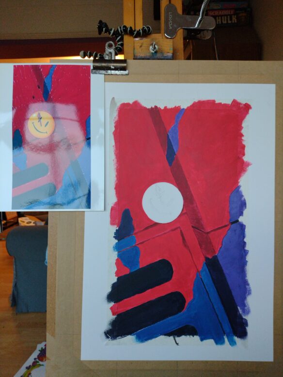
Once I had the color blocked in I started adding the texture and shade. The more I worked the more it became clear that copying someone else’s art style is uniquely challenging. Dave Gibbons had skillfully rendered the flowing blood in a distinctive, stylized way with detailed patterns of light and shade in the rivulets, and glints of light in specific places. His image is no doubt a product of his experience, skill and countless spontaneous choices as he worked. Rendering the blood in my own style would have been relatively straightforward. Matching another artist’s tiny creative decisions was much harder, and a long way from intuitive. The reference images also varied considerably in the level of contrast which greatly affects how visible the blood textures and highlights become.
Acrylics are not the easiest medium to blend smoothly (my fault for choosing them!), so I used a slow drying medium, using several layers and some scumbling with the brush. It took a lot of rework to create subtly blended acrylics which closely (but by no means exactly) mirrored the original. Fortunately Mr. Gibbons’ style doesn’t show brush marks so there was no need to replicate that degree of spontaneity, but it was still a case of very carefully matching something that was originally far more natural. The process was instructive, and I certainly gained a new appreciation for the incredible detail and mastery in the original art.
I kept adjusting as I went to match the shapes and textures of the original as closely as I could, for example adding a thin wash of scarlet ink at a fairly late stage to give the blood more lustre and saturation. Again this is very much a judgement call as my reference images of the original varied from bright scarlet to deep magenta.
My copy nearing completion
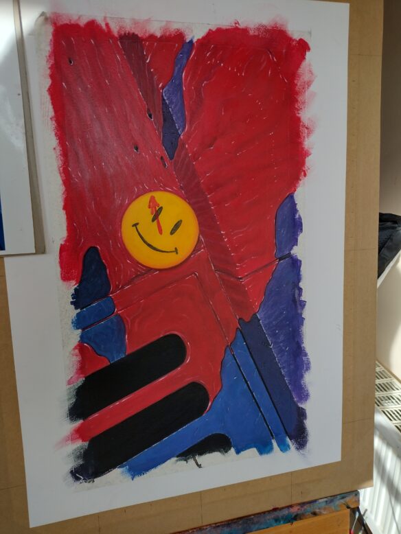
The badge was its own challenge. I nearly had a disaster when I tried to clean up a stray mark and ripped off a coin-sized chunk of the surface of the paper, right on the smoothest and least forgiving part of the image where there was no chance of adding texture to conceal the problem. After a brief trip to the black abyss of despair and a short flirtation with the idea of throwing the painting out of the window I decided to try a very fine grade sandpaper and rich white gesso to rescue the painting and bring the surface of the badge back to smooth. If I’d torn right through the paper you probably wouldn’t be reading this article.
Once I was happy with the painting I added a little “CLARK AFTER GIBBONS” to the bottom to keep me out of art prison, thus ending my career as an international art forger.
Finally I moved onto the back of the badge, which I did to the same scale as the rest of the image. Pádraig was able to supply photos of the back of his original badges from 1986 which was immeasurably helpful. The direction of the pin was to match the “clock hand” blood splatter on the original so I made sure that the light direction matched the rest of the image, and that the tone of the yellow edging matched the front. This was easily the most straightforward part of the project as I was free to make my own art choices. I added one blob of Gibbons-style blood to integrate it with the rest of the image.
The back of the badge
I used Photoshop to add my reversed badge to my full painting, and did a bit of color correction to match the reference.
The final composited image.
All told this painting took me a couple of weeks around my day job. It was much more time consuming than I imagined at the outset because of the unexpected demands of matching another artist’s creative choices, but I’m quite pleased with how it turned out.
James and the Journey Planet team were delighted with the image, and so impressed and enthusiastic as James can be, that they asked to use the images for both the front and back covers. Michael Carroll worked up the sidebar logos in keeping with the original individual issues of Watchmen. The version with the upside-down badge went on the front cover with a yellow logo, and the image with the face-up badge went on the back with a green logo.
Ninety two pages of work from a variety of writers, fan and professional alike – with some fascinating insights – were sandwiched between these pieces when the team Jpresented the Fanzine to the world.
James then asked me if I would share my experience here on File 770. I’m very pleased with how the cover turned out. This was a different kind of undertaking for me but that made it an enjoyable challenge in its own way, one that it stretched me as an artist in unexpected directions by forcing me to realize a specific effect. I have very vivid memories of reading Watchmen when it was first collected (my elderly copy is the British yellow cover from 1987, 3rd printing). Even back then it had a considerable reputation and I gave it the close attention of a hallowed text. I’m happy to have contributed my own little tribute with this cover and grateful to Journey Planet for thinking of me!
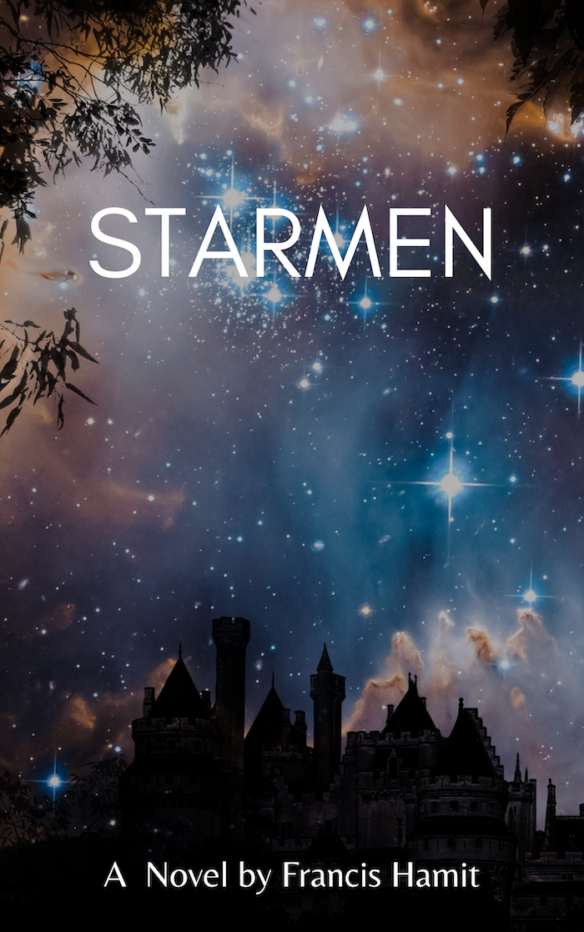
[Introduction: Francis Hamit’s Kickstarter forStarmen: A Novelruns until October 10. You can get the ebook for a one dollar donation. Meanwhile, the author would like your opinion about the cover….]
By Francis Hamit: I really am in a quandary about which cover to use, so I would like feedback.
Alternative Book Cover Version Two
Based on feedback, I moved the title a little. Small changes sometimes make a big difference. I think this is very powerful and catches the eye.
The original cover developed and donated by Markee Book Designs is here:
Original book cover
As you can see this is more narrative, based upon the opening paragraphs. Quite a bit of work went into this but they wanted a sample for their portfolio and I am happy to oblige.
The first book cover I bought was for The Shenandoah Spy. It cost me over $2,000 but certainly sold the story while also feeding my passion for historical accuracy. These new covers cost me very little and the one from Canva took me an hour of playing around with a blank image and placing type.
I have bought other covers for $100 each and just moved virtual type around . It’s not hard for me. I took Design in college and I was a professional photographer for eleven years. That was all about designing as I framed the shot either in the camera or the darkroom. (Yeah, I was in the photochemical world). I was crushed out of that business by K-Mart and their 99-cent color portraits.
These low cost and free blanks for book covers are yet another example of a hard-won artistic profession being crushed by a low cost and “good enough” alternative.
So you tell me; which cover will sell more books? That is, after all, the name of the game.
Leave your vote in comments here.
And if you have not yet donated to get the E-book please do so. Everyone gets that. Other items at higher reward tiers.
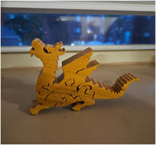
FanTaminals Small Dragon Wooden Puzzle Made by Judy Peterson Rochester, NY
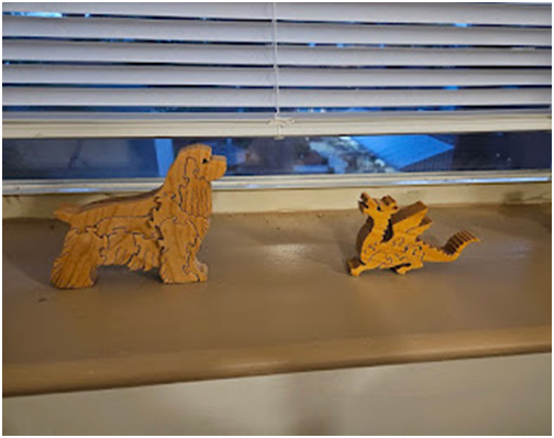
Review by Lis Carey: This little creature, who has revealed her name to be Orlaith, is officially a “small dragon,” but close examination, which she permitted, and discussion with her, has revealed her to be a fire lizard. She’s very small, and quite maneuverable, and as with all of Judy’s work, the workmanship is excellent. As this little one flew to me from An Unnamed Source, I don’t have all the paperwork and can’t tell you her wood with real certainty, but it looks quite like the black cherry that Brandy, the cocker spaniel, is constructed from. It is likely the same wood.
Certainly her pieces are as well-made, and as pleasing to handle. Also like Brandy, she stands up on her four feet, in a way you just can’t expect of most puzzles.
As you can see here, in this picture of Orlaith hanging out with Brandy, she is significantly smaller than the cocker spaniel, and quite happy to be friends with her. This is natural, since they are from the same artist and the same workshop.
They are not hanging out with the Folkmanis beaked dragon, Gwenna. They have determined that they have Different Duties, the wooden puzzles to defend the windows, and the hand puppet to protect the bed. Cider is not sure she altogether approves of Brandy, a dog, not protecting the bed, but concedes the potential awkwardness of doing that, given that Brandy is made of hard, wooden pieces.
Altogether, they enliven my home, and make it more pleasant and attractive.
As noted above, I received Orlaith the fire lizard as a gift.
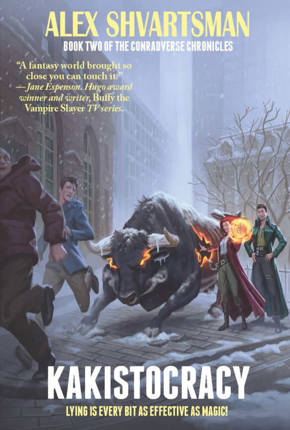
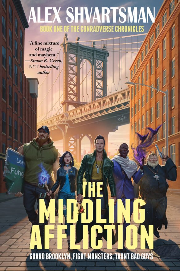
Here’s an exclusive first look at the cover of KAKISTOCRACY, Book Two of the Conradverse Chronicles by Alex Shvartsman, which will be published on September 19, 2023 in print, ebook, and audiobook formats. It is the sequel to The Middling Affliction, published in 2022.
Cover art for both books has been created by Tulio Brito.
Here’s the publisher’s back-of-the-cover blurb:
If you do it well, lying is every bit as effective as magic.
Conrad Brent has no innate magic, so he bluffs a lot and uses a myriad of magical items to protect Brooklyn from monsters and arcane threats. As a member of the Watch, the group that protects the mundane humans from such dangers, he risks his life on a regular basis. Sometimes twice before lunch. Sometimes during lunch, when he dares order his food from a street cart.
After regaining his position in the Watch which he’d temporarily lost due to the machinations of a variety of evil-doers, Conrad doesn’t want to take any risks he doesn’t have to. But now his boss is missing, there’s a totalitarian new regime in City Hall oppressing all magic users, and the mayor has aligned himself with a diabolical villain.
In order to save the day, Conrad must team up with a recovering necromancer to mediate a dispute between two ancient enemy factions, solve a mystery of a warded house adjacent to a cemetery, and stand with his friends against tyranny.
That is, if the interdimensional fae assassins don’t get him first.
You can preorder Kakistocracy at your local bookstore, or via the following links:
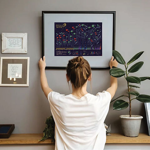
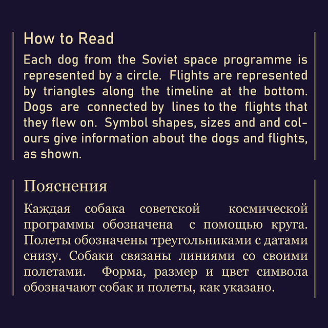
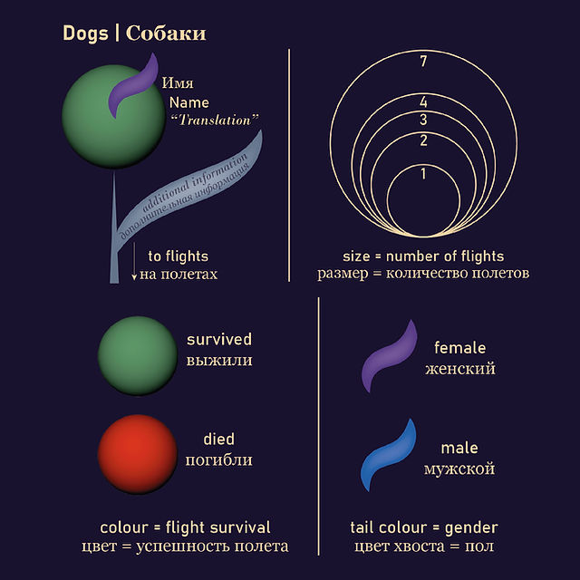
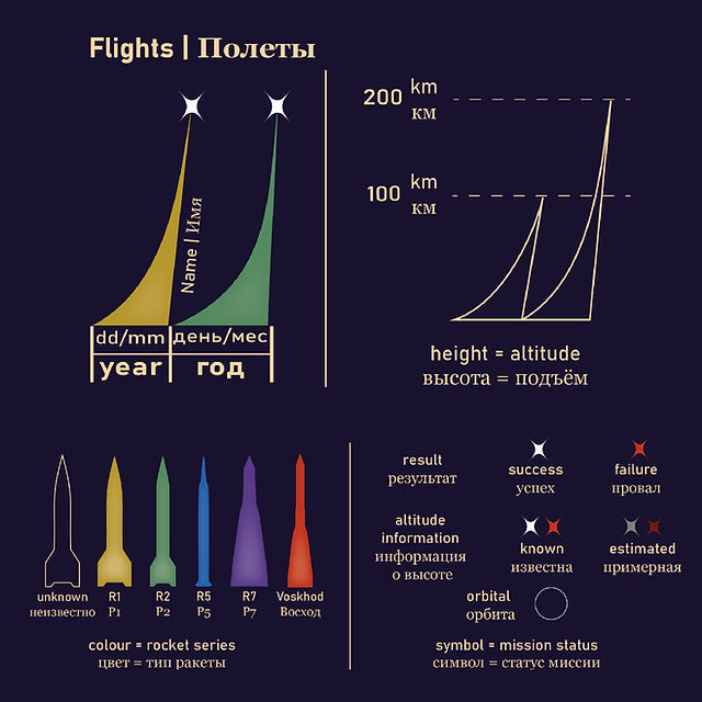
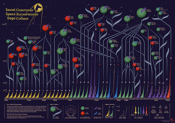
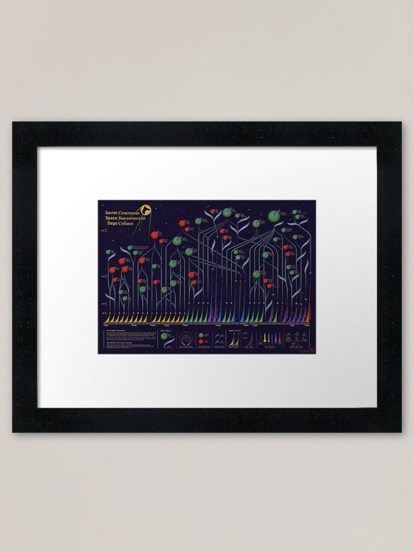
European fan Phoenix (she/her) recently announced her first data visualization art project about the flights and fates of the Soviet space dogs. Inspired by space, science and science fiction, Phoenix also loves animals, especially dogs, and has provided a forever home to several rescue dogs. Her Soviet Space Dogs project combines these two loves and is being sold to raise money for dogs abandoned due to the conflict in Ukraine.
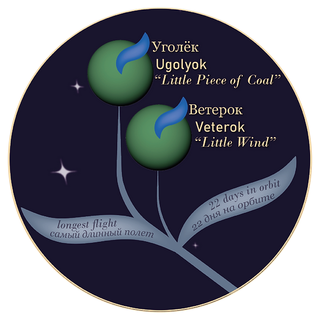
The sad story of Laika, the first animal to go into orbit, is known amongst space enthusiasts around the world, but Laika was just one of many dogs that played a vital role in the Soviet space program. Their story is told eloquently by Olesya Turkina, Senior Research Fellow at the State Russian Museum in St. Petersburg, in her 2014 book Soviet Space Dogs. Phoenix’s dual language (English/Russian) digital artwork visualizes the data from the book and tells the story of the Soviet space dogs pictorially, from Dezik and Tsygan, the first dogs to leave the Earth, via Laika, the first animal to orbit the Earth; and Belka and Strelka, who were the first to survive orbit; to Ugolyok and Veterok, who survived the last and longest flight, spending 22 days in orbit.
LaikaBelka & StrelkaUgolyok & VeterokOtvazhnaya
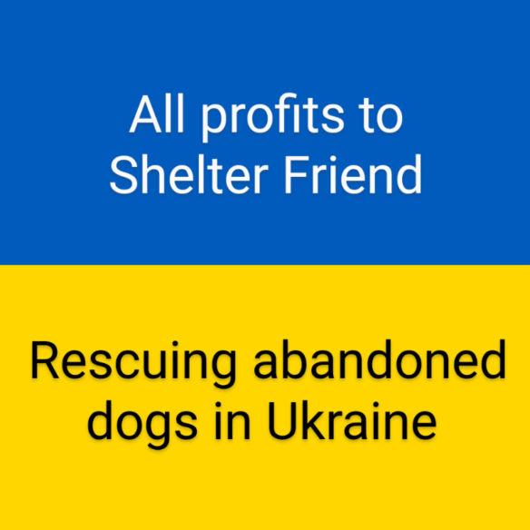
Prints and products featuring the Soviet Space Dogs visualization are being sold online via Redbubble, with all profits going to support Ukrainian charity Shelter Friend who are rescuing dogs which have been abandoned due to the current conflict. Copies of the book are available from the publisher, and currently include a 10% donation to the British Red Cross Ukraine Crisis Appeal. Direct donations to Shelter Friend can be made via PayPal to [email protected].
Borys Sydiuk from Kyiv said “Supporting Shelter Friend at this time is a wonderful thing to do, and Ukrainian Fans thank Phoenix for her beautiful work”.
A limited edition Soviet Space Dogs print will be on display in the art show at the upcoming Worldcon in Chicago, where signed prints will also be available in the print shop. Thanks to fannish generosity, the print production and art show costs have been covered, so all proceeds from sales at the convention will go to the charity in full.
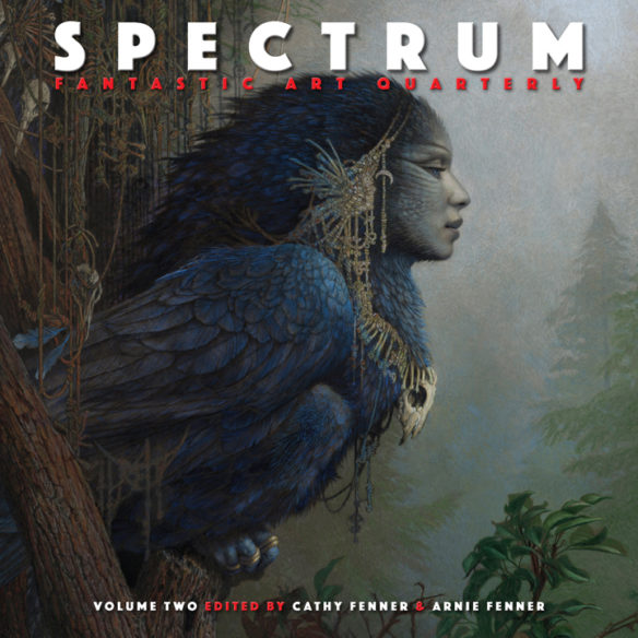
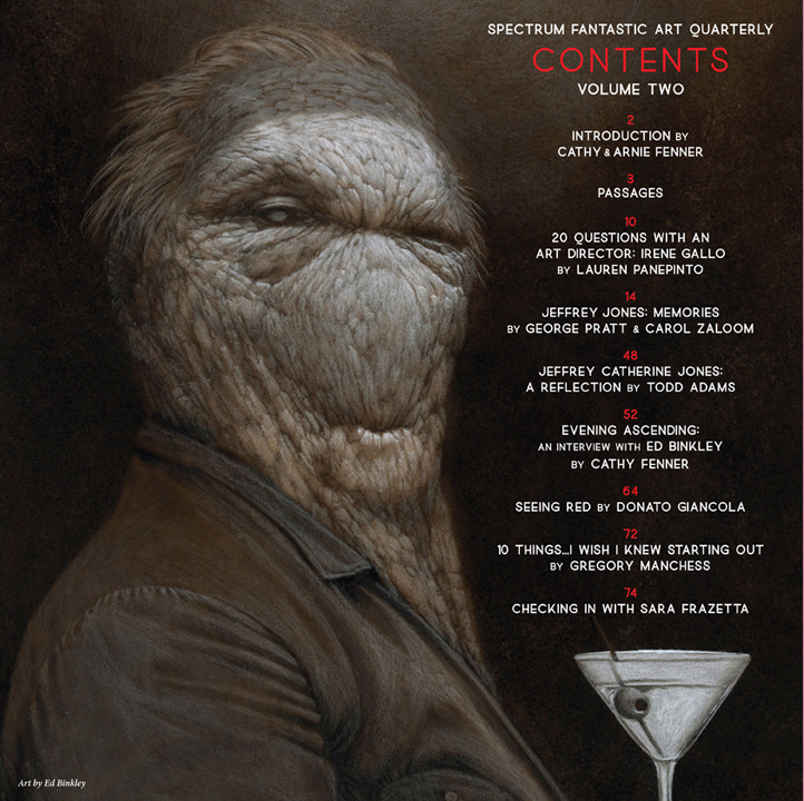
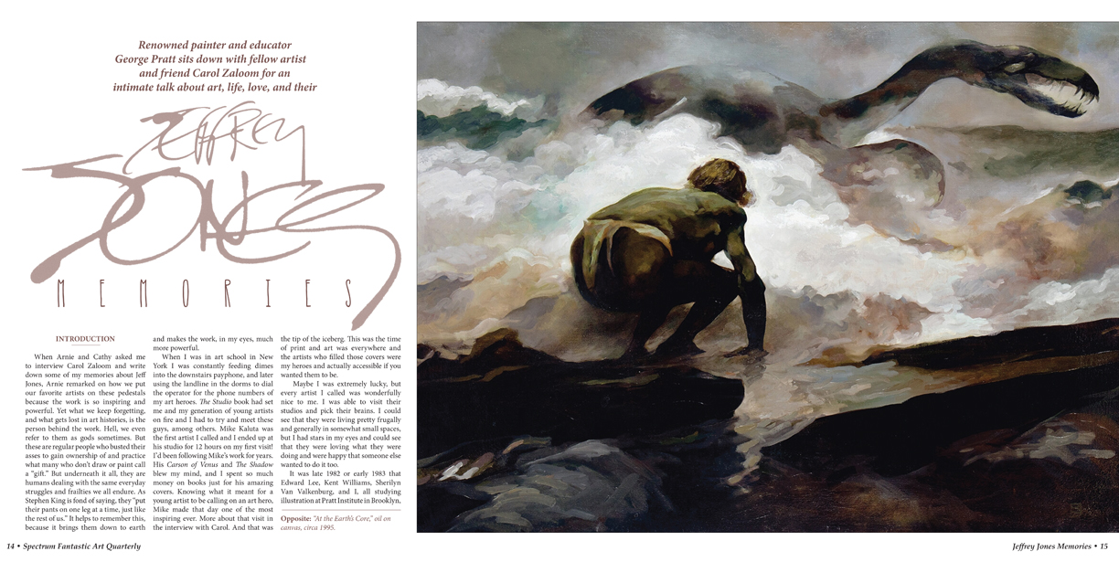
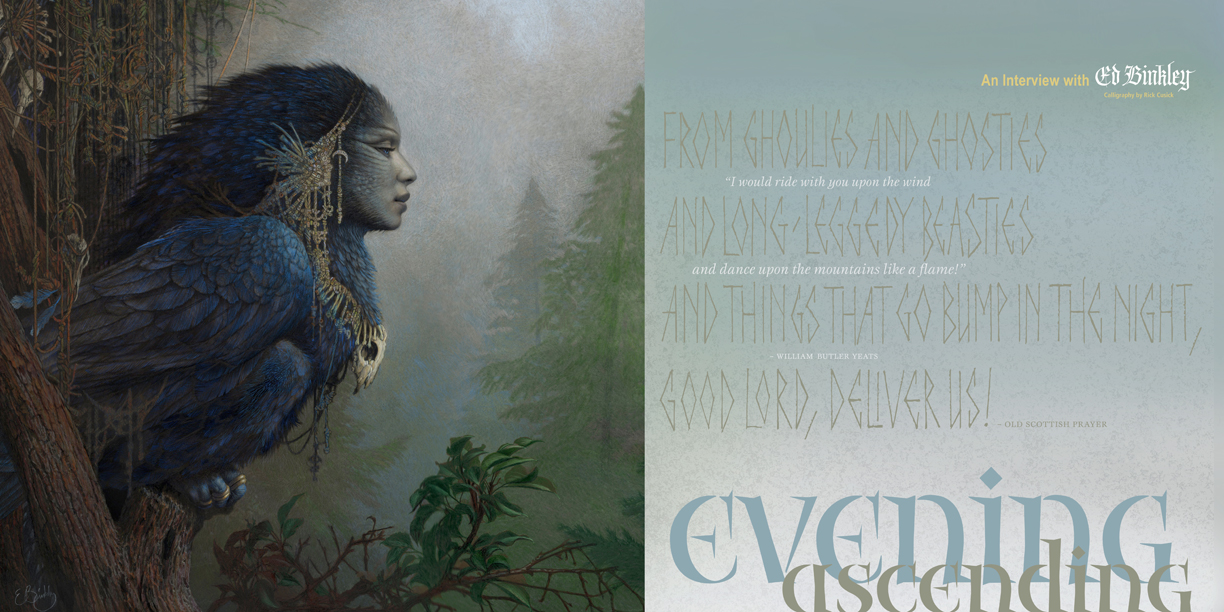
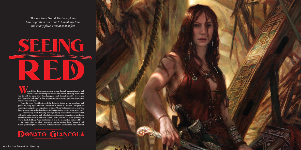
The second issue of Spectrum Fantastic Art Quarterly from Arnie and Cathy Fenner is available. “The introduction explains our tardiness,” notes Arnie. Copies are being sold through Bud Plant, Stuart Ng, Dreamhaven Books, and Forbidden Planet NYC.
Jeffrey Catherine Jones is the featured artist in an all new 39-page examination. George Pratt, Todd Adams and model Carol Zaloom share their memories and we are treated to page after page of paintings and new details of Jones’ life and work.
Also: Fantastic art painter Ed Binkley is interviewed and featured on the cover. His work is stunning.
Donato Giancola explains how inspiration shows up for him, with wonderful examples from Lord of the Rings paintings. Gregory Manchess shares insights and pointers. Sara Frazetta shares memories of her grandfather Frank Frazetta. Art Director Irene Gallo offers tips to illustrators in a 20-questions feature. Arnie writes poignant memoriams for James Bama, Neal Adams, Ken Kelly, George Perez, Tim Sale and Marshall Arisman—“six masterful members of our art community who left us in 2022.”
Arnie had a serious health issue which was the cause for this issue being delayed (it IS called Spectrum Quarterly). He touches on that in his typically insightful and thoughtful editorial, and reveals the next Spectrum Annual Volume 28 will be out in 2023 after a hiatus since Volume 27.
Carol Zaloom modeled for Jeffrey Jones herself but more importantly, she was a close friend with Joners’ most famous muse and model Sandi Zinaman (1952-2015). She figures in many paintings and this includes photos of her modeling for Jones. She was the inspiration for the voluptuous heroine of the Idyl series.
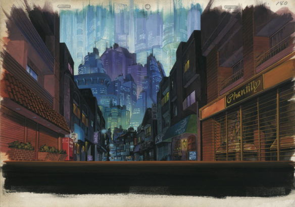
The opening scenes of Akira tell the story of how Neo Tokyo has surfaced from the ashes, and in Akira we soon meet the characters that will play such importance. The music draws us into the city and the high speed motorbike action that sets viewers up for a science fictional epic. The film was hugely popular, on video in the early Nineties and since has gained a huge following and is recognized as an incredible piece of anime, leading the charge and explosion of manga and anime in Europe.
Stefan Riekeles, head of Riekeles Gallery, in collaboration with the Museum for Architectural Drawing director Nadejda Bartels and co-curated by Hiroko Myokam of Eizo Workshop (Japan) present an incredible selection of imagery for fans of Akira to enjoy and appreciate. With fifty-nine pieces on display in two galleries over two floors, the exhibition is beautifully set out, with a logical layout that allows one to enjoy the art sequentially. The colors and strength of the art represents the background vividness of the film. For speakers of English, all descriptions are in German and English, while language is no real barrier to enjoying the art.
The art is astounding, and while it looks well framed on walls, as one goes closer to consider the media and skill utilized, the art pops out. The dark scenes painted so skillfully that the neon and light works so well. While very static, the images are a delight to see and come in a variety of sizes. It was wonderful to see the layering of cells over background imagery and how scenes which were panned by the camera are drawn at the correct angle and length, the uniformity being that of brilliance, not size or format. The long view of Tokyo, Chantilly Corner where Tetsuo falls in the initial Bike Chase, the alleys and city are all breathless as the art variety demonstrates details and expansiveness. The removal of cells in most cases, the foreground, allows contemplation of the architecture and ingenuity of the art. Pencil concept drawings, layout drawings, imageboards, and of course the backgrounds all add up to give the viewer a very comprehensive and thoughtful view of Neo Tokyo.
Akira, while so well known, is not a subject that is often seen in exhibitions. Riekeles was allowed exclusive access to Studio archives of the artists involved, and these works have not been exhibited before, and it is unclear if they will be again. The art being shown includes works by Akira‘s art director Toshiharu Mizutani and production artists Katsufumi Hariu, Norihiro Hiraki, Shinji Kimura, Satoshi Kuroda, Hiromasa Ogura, Hiroshi Ōno, Hajime Soga, Tsutomu Uchida and Takashi Watabe.
The Tchoban Foundation Museum for Architectural Drawing, is the perfect setting, an unusually beautiful building in a very nice Berlin neighborhood, where coffee shops with street seating are just around the corner. The building is modern and unique, with the ground floor entrance feeling like a library and lounge, spacious, open and welcoming, the staff are excited about fans of the film seeing the work, and keen to share the appreciation of architecture. Set over two floors with a lift between them, as well as the two galleries, there is a small viewing room and one can see clips and identify the use of some of the art.
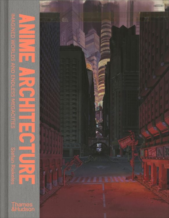
Riekeles has written a wonderful book which makes for fine accompaniment to the exhibition. Anime Architecture – Imagined Worlds and Endless Megacities by Stefan Riekeles was published by Thames & Hudson in 2020 and was available to view at the Museum. The Riekeles Gallery also has a number of posters and very high-quality prints for sale, limited in number, signed by the artists, on the Riekleles Gallery .
The area nearby is well worth a visit for fans touring in Berlin. The Neo Tokyo bookshop has a huge stockliist of manga and Japanese Culture on Tor Strasse, and, Grober Unfug and Modern Graphics are two comic book and manga shops a few minutes walk away. St. Georges bookshop specializes in English books and has a selection small of mostly second hand science fiction and fantasy. A short two-stop U-Bahn trip away is Black Dog comics, an incredible shop full of American and English European titles and Patrick the owner, is a huge SF film fan who is very engaging.
The Architecture of Neo Tokyo is well worth a visit if you are in Berlin and have an appreciation of Akira.