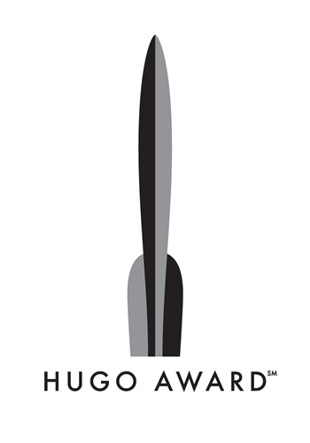
Jeremy Kratz' Hugo Award logo
Jeremy Kratz’ new Hugo Award logo design seemed good at first glance and I like it more and more as time goes by.
Kratz’ design was the winner in a contest arranged by the Worldcon’s Hugo Marketing Committee. Out of the hundreds of entries, judges Chip Kidd, Irene Gallo, Geri Sullivan and Neil Gaiman settled on a simple icon, one that will hold its own on a busy paperback cover or on a banner hung in a convention center.
The use of the four-finned rocket in the logo was mandated by the contest rules. That’s what the award looks like, after all. But think how preferring a rocket must have complicated the judges’ task. They not only had to make an artistically sound choice, they also had to avoid selecting a logo that was likely to be confused with others already in use. There are a lot of sf-themed businesses and organizations using logos with rockets in them — Tor.com, the Science Fiction League, and many, many others.
One thing that amused me about the choice – prompted me to joke “We needed a contest for this?” – was its unwitting resemblance to an idea I’d had back when fans first started talking about having a logo.
I’d immediately visualized the Hugo nominee pins we used to get. They were little silver rockets with tiny vanes at bold right angles to the hull. (Mike Resnick has so many he wears them on a bandolier and looks like he’s about to say he doesn’t have to show you any stinkin’ badges.) I always thought the design looked straight off the drafting board, one that easily could be turned into an attractive graphic.
The rounded fins of Kratz’ logo show his inspiration was the rocket trophy rather than the pins. That said, isn’t it subjective reactions like these that drive a blog?
(And lest we forget, “World Science Fiction Society”, “WSFS”, “World Science Fiction Convention”, “Worldcon”, “NASFiC” and “Hugo Award” are service marks of the World Science Fiction Society, an unincorporated literary society.)
